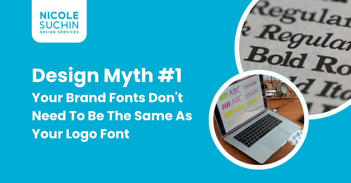
Design Myth #1: Your Brand Fonts Don't Need To Be The Same As Your Logo Font (But They Should Connect)
A popular misconception I run into often when designing visual identities and logos is the belief that if you used a font on your logo, you should also use it across all your branding touch points. And as easy as that decision can be, it's not always true!
...Emphasis on the "not always".
Is it true in some cases? Absolutely!
All cases? Absolutely not.
So what is the determinant of to use or not to use the same font? For me, it comes down to 2 factors and 2 questions worth asking:
1) Readability: How readable is the font in all contexts it will be used in?
2) Accessibility: How easily can you access the font, and how many variations exist of it?

1) Readability
How readable is the font in all contexts it will be used in?
When it comes to logo development, you work with business names of all lengths. Some long, some short, some that break apart, some that stay within a certain shape, the needs and variations change and shift with each project. With this process, there is often a creative journey you go on when hand selecting typefaces and fonts that match the overall look and feel.
But, this same process doesn't always align when it comes to building out the rest of your marketing materials. That quirky letter 'A' may have been fun for the logo, but it looks crazy when you put it in your blog header. For your website, your brochures, your letterheads, your presentations – you want a font that's easy on the eyes, easy to read, and isn’t distracting. And sometimes, the logo font isn't that once it's put into the context of long headlines or heavy strings of text.
You also have to consider type size variation. That dynamic typeface might look super cool for your business name, but in small subheadlines it might start reading like another language.
For these reasons, choosing a font that has better readability might be necessary when it comes to the rest of your brand touchpoints.

2) Accessibility
How easily can you access the font, and how many variations exist of it?
Here’s the harsh truth a lot of us designers hate to face – not all fonts are made the same. And I’m not saying that in the metaphorical sense. They are quite literally not all made the same. Different fonts are created by different designers with different weights, variations, price ranges, glyphs, and file outputs. Many times us designers may dig through the web to find that perfect font for our logo project only to find out – whoops, it only exists in Extra Heavy Bold and has no exclamation points.
Non-designers, you might be thinking – who makes a font without an exclamation point?!
Evidently…a lot of font designers.
And when it comes to building out your business pitch deck, a font that only exists in Extra Heavy Bold and no exclamation points simply is no going to fly. Not only that, but you need font variations!
You need light weights for body text, italics for emphasis, maybe even a condensed version to squeeze in that extra bit of information on your brochure. If your "cool" logo font is a one-trick pony with limited styles, you're going to be stuck trying to force it into places it doesn't belong.
Trust me, that's a recipe for a disjointed brand look. So, when you're considering a font, especially for your logo, take a peek at its family tree. Does it have siblings? Cousins? A legacy of weights and styles that can work across all your materials? If not, you might want to consider something new.

Final Thoughts
Before I conclude I want to make one critical point (that I conveniently left in the parentheses of my title) – Your brand fonts might not always the be same as your logo font, but the absolutely should connect to your logo font.
What does that mean exactly? It means that while a logo font has different criteria than your brand fonts, that doesn't mean it should be wildly different than your logo's visual look. A brand should visually look and emotionally feel like a cohesive whole. In other words - if your logo has a bold, impactful, and dominating look, then the paired fonts should match this. If the logo has a feminine, intricate, and refined look - then your paired fonts should match this.
Having trouble figuring out what fonts to use on your logo or your branding? Consider working with a designer who understands how to bring your vision to life with powerful visuals!

Thanks for reading!
My name’s Nicole Suchin and I am a Graphic Designer based in Pittsburgh, PA that specializes in branding, as well as design for print and digital marketing.
If you’re looking to brand, re-brand, or start your sub-brand – I’d love to chat more about what that could look like for you and your business!